YouTube’s New Player Update: What’s Changed and How It Improves Your Viewing Experience
Posted on October 21, 2025 by James Martin
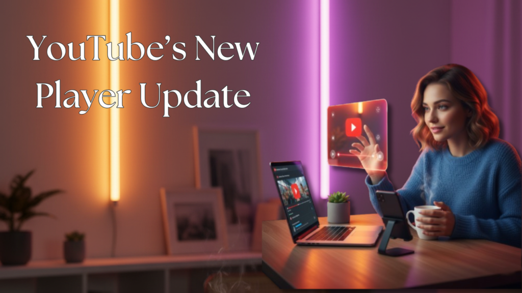
YouTube has quietly rolled out one of its most noticeable updates in recent times — a redesigned video player that feels smoother, cleaner, and more interactive. This change is now live across mobile, desktop, and smart TV apps, and it’s already getting mixed but curious reactions from creators and viewers alike.
If you’ve recently opened YouTube and thought, “Wait, did something look different?”, you’re not alone. The new update isn’t just cosmetic; it’s focused on improving how people watch and control videos. Let’s break down what’s new, why it matters, and how you can make the most of it.
A More Transparent, Minimal Look
The first thing you’ll notice is how light and transparent the new video player feels. YouTube has moved away from heavy black control bars and replaced them with a more subtle interface.
When you tap the screen on mobile or hover your mouse on desktop, you’ll see the play, pause, volume, and progress controls fade in gently — giving the video more space to breathe. It’s a small design choice, but it makes the player look much more modern, similar to the clean UI trends we see on Netflix or Apple TV.
This transparency helps you focus on what matters most — the content itself. Whether you’re watching a vlog or a tutorial, the interface feels less intrusive and more polished.
Smoother Double-Tap Skip Feature
YouTube’s double-tap to skip gesture, which lets you jump ahead or go back by 10 seconds, has also been refined. Now, it feels smoother and more responsive, especially on Android and iOS devices.
The animation looks fluid — with a curved skip overlay and soft fade-in effect — giving you immediate feedback that your gesture worked. For people who binge-watch content or rewatch tutorials, this makes navigation feel effortless.
It’s a small quality-of-life improvement, but it’s one of those things that you’ll immediately appreciate once you’ve used it for a while.
Unified Design Across Devices
Another subtle but important part of this update is consistency. YouTube’s new design now looks and behaves similarly across mobile, web, and smart TVs.
This means that no matter where you’re watching — your phone, laptop, or television — you’ll notice the same icons, control positions, and gestures. It’s part of YouTube’s broader effort to make its experience seamless across platforms, something users have been requesting for years.
It’s also likely that YouTube wants to make its TV app more visually aligned with its desktop interface, since more people are now watching long-form content on bigger screens.
New Control Animations and Responsiveness
YouTube has put effort into how the controls feel when you use them. The play and pause buttons now have soft motion transitions, while the progress bar responds instantly to your clicks or taps.
Scrubbing through a video (moving the red progress indicator) feels much more fluid — the preview thumbnails load faster, and the playback doesn’t stutter as much when you jump to a different part.
On slower devices or networks, you’ll notice that these small refinements make watching videos more pleasant and less glitchy.
Why YouTube Is Focusing on UI Updates
Over the last few years, YouTube’s interface has changed only slightly — usually in the form of icon tweaks or color updates. This redesign feels different because it’s more user-focused than ever.
YouTube wants to make its platform feel modern and fast while staying familiar. The goal seems to be reducing visual clutter and making navigation more natural, especially for the massive audience that watches on mobile.
Another possible reason behind this UI change is to make the player ready for future features — things like new playback controls, AI-based recommendations, and gesture-based shortcuts that might arrive later.
What Users Think About the Update
Reactions to the new player are mixed. Some users enjoy the cleaner, more modern interface and appreciate the smoother navigation. Others, however, find the new design less appealing.
- A poll by Android Authority showed that 48% of respondents preferred the previous design, calling the new one “confusing” or “visually unappealing.”
- About 20% liked the update, and 17% hadn’t experienced it yet.
- On Reddit, some users criticized the design as overly simplistic, while others praised features like improved comment threading, which now resembles a forum-style layout for better readability.
In short, while the update has practical improvements, many users are still adjusting to the aesthetic changes.
How to Try It and Explore the Features
If you haven’t seen the new player yet, update your YouTube app from the Play Store or App Store. For desktop users, the update should automatically appear once you refresh your browser.
To explore:
- Double-tap left or right to test the skip gestures.
- Tap once to see the new floating control panel.
- Notice how the progress bar, captions, and quality settings now fade in and out more gently.
It might take a day or two to get used to it, but most users agree that once you adapt, the older version starts to feel outdated.
Final Thoughts
YouTube’s new video player update isn’t about adding flashy new tools — it’s about refining what already works. It makes everyday viewing smoother, more consistent, and visually lighter.
For creators, this change means your videos might look even better on all devices, especially for audiences watching in full screen. And for viewers, it simply makes YouTube feel more modern without losing its simplicity.
As YouTube continues to evolve in 2025, small updates like this remind us that design and usability still play a big role in how we enjoy content online.
Categories: Uncategorized